How to Optimize Website for Mobile: Recommended Strategies ✅

Introduction to Mobile Optimization
Over 60% of all internet traffic now comes from mobile devices, making mobile optimization essential for any website. If you want to improve visibility and keep visitors engaged, knowing how to optimize website for mobile is crucial. Google’s mobile-first indexing means the search engine primarily uses the mobile version of your site to determine rankings. A website that isn’t optimized for mobile could see higher bounce rates, lower mobile conversion rates, and ultimately, a drop in traffic. On the other hand, a mobile-friendly site can improve user experience, speed up loading times, and keep your audience coming back.
Responsive design, fast page speed optimization, and clean, readable content are just a few of the factors that contribute to a strong mobile presence. As we move further into 2025, the need for mobile SEO best practices and seamless touchscreen navigation becomes even more important. By the end of this guide, you’ll know exactly how to make your website look and perform great on any device, giving your visitors a smooth, enjoyable browsing experience.
How to Implement Responsive Web Design
One of the first steps in learning how to optimize website for mobile is implementing responsive web design. Responsive design ensures your website adapts smoothly to any screen size—whether it’s a smartphone, tablet, or desktop. This flexibility is critical because users expect a seamless experience regardless of the device they’re using.
Key aspects of implementing responsive design include:
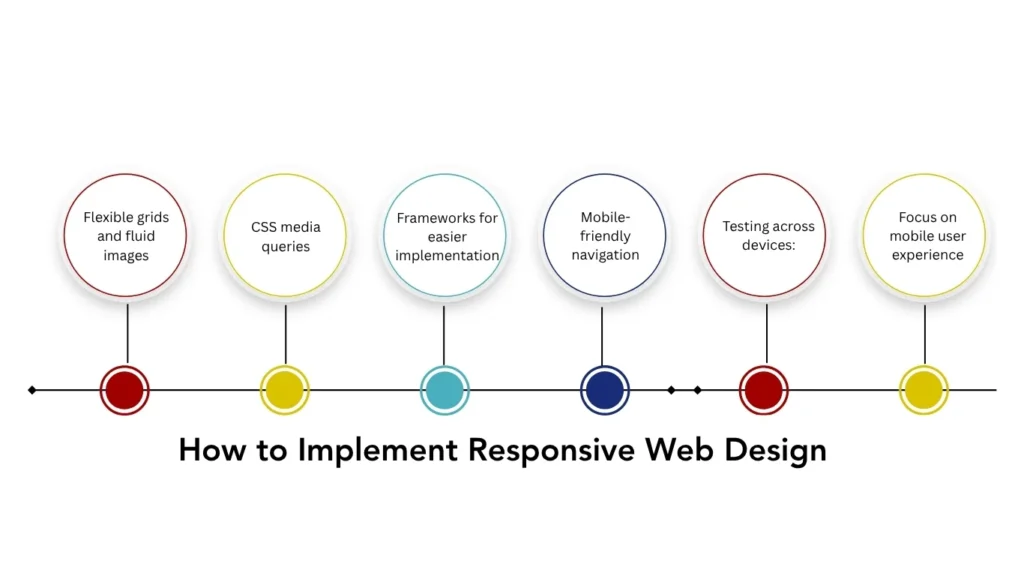
- Flexible grids and fluid images: Automatically adjust layout and visuals based on screen size.
- CSS media queries: Apply different styling rules for various devices to maintain a consistent look.
- Frameworks for easier implementation: Use tools like Bootstrap, CSS Grid, or Flexbox to simplify responsive design, even without advanced coding skills.
- Mobile-friendly navigation: Ensure menus are easy to tap, buttons are large enough for touchscreens, and content is structured for quick scanning.
- Testing across devices: Use tools like Google Mobile-Friendly Test and BrowserStack to see how your website performs on smartphones, tablets, and desktops.
- Focus on mobile user experience: A clean, easy-to-use interface improves usability, reduces bounce rates, and increases mobile conversion rates.
Responsive design isn’t just about aesthetics—it’s the foundation for better page speed optimization, improved SEO, and overall success in today’s mobile-first world.
Enhancing Mobile Page Speed
Once your website is responsive, the next step in learning how to optimize website for mobile is improving mobile page speed. Slow-loading pages frustrate users, increase bounce rates, and can hurt your search rankings. Even a few seconds delay can lead to lost visitors and missed mobile conversion opportunities.
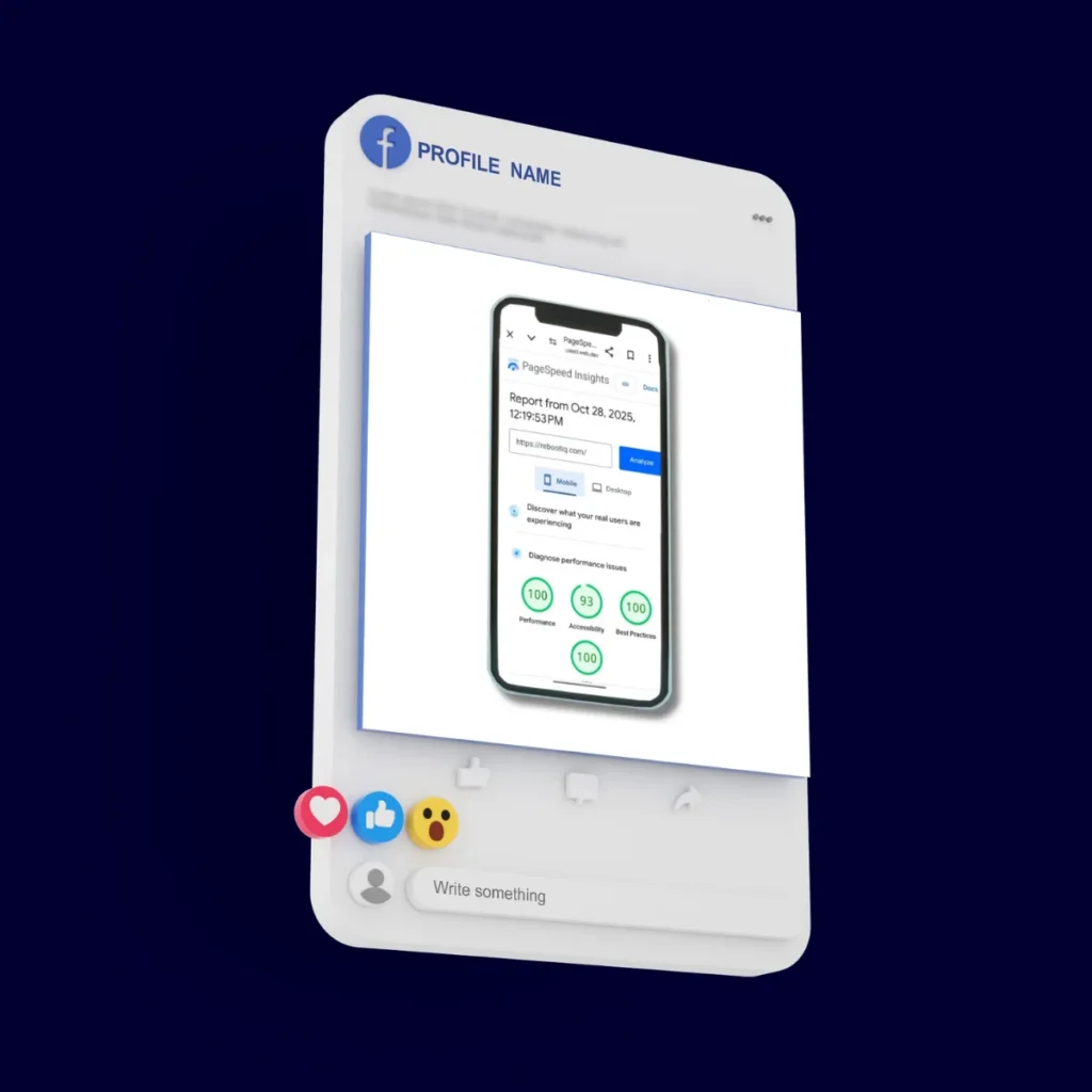
To boost page speed, start by compressing images without sacrificing quality. Large images are often the main culprit behind slow mobile sites. Next, minify CSS, JavaScript, and HTML to reduce unnecessary code that slows down loading. Implementing lazy loading ensures images and videos only load when visible on the screen, which speeds up initial page render. For high-traffic sites, consider AMP (Accelerated Mobile Pages) to create ultra-fast, mobile-optimized pages. Monitoring tools are essential. Use Google PageSpeed Insights, Lighthouse, or GTmetrix to measure your site’s performance on mobile devices. These tools provide actionable recommendations like reducing server response time, enabling browser caching, and optimizing render-blocking resources.
Another tip is to prioritize above-the-fold content so that users see meaningful content immediately, even if the rest of the page is still loading. By combining responsive design with fast-loading pages, you enhance mobile user experience, improve SEO, and increase the likelihood of converting mobile visitors into customers.
Remember, speed is a critical part of mobile SEO best practices, and consistent monitoring ensures your website remains fast and user-friendly across all devices.
Optimizing Mobile Content
After making your website responsive and fast, the next step in how to optimize website for mobile is ensuring your content is mobile-friendly. On smaller screens, users want information quickly and clearly. Long paragraphs, tiny text, or cluttered layouts can make reading frustrating, causing visitors to leave your site.
Start by keeping your content concise and scannable:
- Use short paragraphs, bullet points, and headings to break up text.
- Choose clear, readable fonts and sufficient line spacing for better mobile user experience.
- Avoid intrusive pop-ups or interstitials; use inline banners or subtle notifications instead.
- Optimize visual content like images and videos for faster loading and clarity.
- Ensure touchscreen navigation is smooth; buttons and links should be large enough to tap easily.
Don’t forget mobile SEO best practices: include keywords naturally in headings, meta descriptions, and alt text for images. Use structured data where relevant. Focus on engagement: ask questions, include call-to-actions, and structure content around what mobile users are likely searching for. By following these tips, you can significantly boost your mobile conversion rate and retain visitors.
Mobile SEO Best Practices
Once your website is responsive, fast, and content-friendly, it’s time to focus on mobile SEO best practices. Optimizing for mobile search ensures your site ranks well on Google and delivers a smooth experience to visitors. This is a crucial part of how to optimize website for mobile effectively.
Start with mobile-friendly navigation. Menus should be easy to tap, search functions accessible, and important links visible without scrolling endlessly. A clean, intuitive structure reduces mobile bounce rates and improves user satisfaction. Implement structured data on your mobile pages. Schema markup helps search engines understand your content, which can lead to rich results in mobile search. It also improves mobile visibility and click-through rates.
Another key factor is local SEO optimization. Many mobile users search for nearby services, so including local keywords, Google My Business listings, and NAP (Name, Address, Phone) consistency is essential. Monitor your mobile performance using analytics tools. Track metrics such as page speed, bounce rate, session duration, and conversions. Tools like Google Analytics and Google Search Console can provide insights into how mobile visitors interact with your site.
Finally, optimize images, videos, and other media for mobile, and ensure your touchscreen navigation is smooth. Combining these strategies with responsive design and fast pages ensures your website not only looks good but ranks higher, drives traffic, and converts mobile users into loyal customers.
Testing and Monitoring Mobile Performance
Testing and monitoring are critical steps in how to optimize website for mobile. Even after implementing responsive design, fast loading, and mobile-friendly content, your site may still face issues on different devices or screen sizes. Regular testing ensures a smooth mobile user experience and helps maintain high search rankings. Start by using tools like Google Mobile-Friendly Test, Lighthouse, and BrowserStack to evaluate how your website performs across smartphones and tablets. These tools highlight issues with layout, font sizes, touch elements, and page speed. Keep an eye on mobile analytics metrics such as bounce rate, session duration, and mobile conversion rates. This data helps identify problem areas and informs optimization decisions. For example, if users drop off on a certain page, it may need faster loading, better formatting, or improved navigation.
Additionally, gather user feedback directly from mobile visitors. Real-world insights often reveal usability issues that tools cannot detect. Combining analytics data with user feedback allows you to continually refine your mobile website.
By regularly testing and monitoring, you not only maintain a mobile-friendly website design but also improve SEO performance, enhance usability, and boost conversions. Consistency is key to keeping your mobile visitors engaged and satisfied.
Conclusion and Next Steps
Optimizing your website for mobile is no longer optional—it’s essential for user experience, SEO rankings, and conversions. By following best practices for responsive design, mobile page speed, and mobile-friendly content, you create a site that works seamlessly on any device. Implementing mobile SEO best practices, structured data, and smooth touchscreen navigation ensures search engines and users alike have a positive experience. Regularly test and monitor mobile performance using tools like Google Mobile-Friendly Test and Lighthouse, and make adjustments based on analytics and user feedback. Start small, focus on one improvement at a time, and track results to understand what works best for your audience.
By following these strategies, you’ll not only learn how to optimize website for mobile but also build a site that keeps visitors engaged, improves rankings, and drives conversions. Now is the perfect time to take action and make your website truly mobile-friendly.